I have no formal education in data visualization. When I developed the first version of Chanalyzer1, the display mimicked Agilent and Tektronix spectrum analyzers. Chanalyzer 2.0 innovated slightly in that it showed multiple views of the data simultaneously, but each view was still mimicking Agilent and Tektronix.
It wasn’t until 2009 when a business advisor mentioned the name Edward Tufte that I even became aware of the field of data visualization… in hindsight I definitely should have researched and become familiar with data visualization earlier in the entrepreneurial journey, but better late than never, right?!
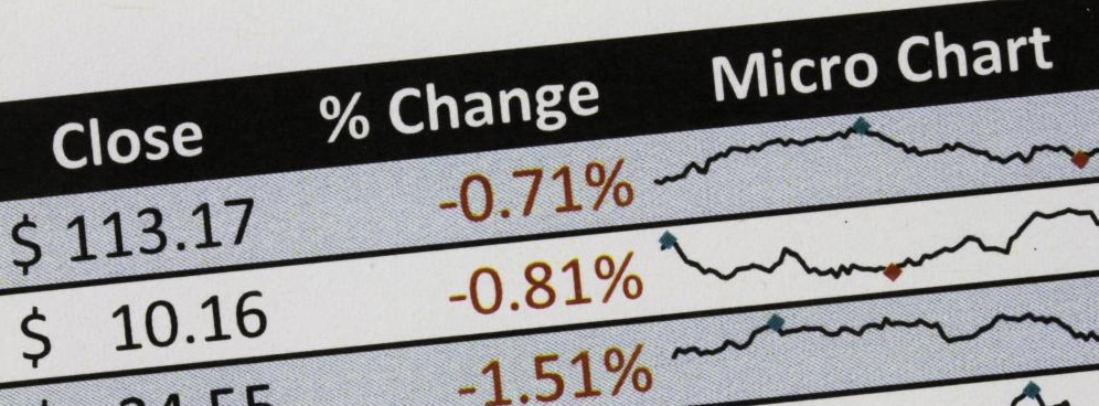
Edward Tufte is rightly regarded as the godfather of modern data visualization. Have you seen the tiny little graphs next to each ticker symbol on the stock page? It’s called a sparkline, and he invented them. Anyway, if you are into data analysis, visualization, etc. I highly recommend reading Edward Tufte. Now on to the book review!
The Visual Display of Quantitative Information begins with the history of data graphics, which is a relatively new invention. Both cartography and statistics were developed centuries before the innovation of putting the two together. It wasn’t until the late 1700s that statistical graphics were invented. Chapter 1 explores the invention of data visualization techniques such as data maps, small multiples2 and multivariate data.
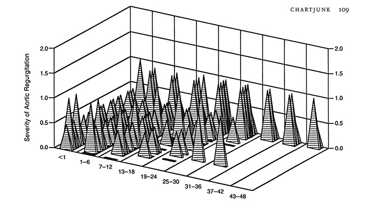
Chapter 2 is titled Graphical Integrity and points out many of the ways that graphs can distort the underlying data – you know those graphs that make a small difference appear to be HUGE? Tufte provides examples of different ways to data graphics are misused and ends the chapter with six principles of data integrity:
- The representation of numbers, as physically measured on the surface of the graphic itself, should be directly proportional to the numerical quantities represented.
- Clear, detailed, and thorough labeling should be used to defeat graphical distortion and ambiguity. Write out explanations of the data on the graphic itself. Label important events in the data.
- Show data variation, not design variation.
- In time-series displays of money, deflated and standardized units of money measurements are nearly always better than nominal units.
- The number of information-carrying (variable) dimensions depicted should not exceed the number of dimensions in the data.
- Graphics must not quote data out of context.
Part 2 of the book dives into the Theory of Data Graphics, beginning with a chapter on Data-Ink. Tufte is a big proponent of using ink to display the data and relevant context, not on irrelevant matters such as data grids, decorations, shading, etc. He suggests maximizing the data-ink ratio within reason and erasing non-data-ink (also within reason). In other words, put all the focus on the data, not the fluff around the data like 3-D drop shadows. Building on the data-ink argument, the next chapter dives into “Chart Junk,” followed by a chapter with guidance on Data-Ink Maximization.
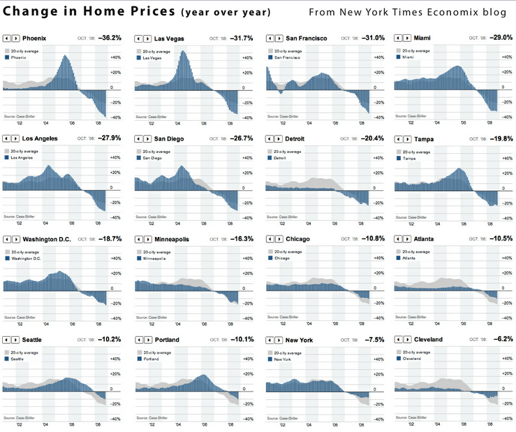
The next few chapters are where the book really shines by sharing techniques for multifunctioning graphical elements, high resolution data graphics, and aesthetics and techniques in data graphical design. Tufte dives into the usage of small multiples, sparklines, and other techniques to represent a lot of data in a small graphic.
Applying Tufte’s Concepts to Chanalyzer
The concepts found in The Visual Display of Quantitative Information were eye-opening to me when I first read this book. It caused me to analyze all of the graphics in Chanalyzer and inSSIDer to figure out where we had poor data-ink ratios – graphics that focused too much on the labels and gridlines rather than the data contained in the graph.
Here’s an example of some of the changes that we made to Chanalyzer based on Edward Tufte’s concepts. The first image below shows the 2.4 GHz spectrum with signals colored by amplitude, which is the Y-axis. High amplitude is colored red and low amplitude is colored blue. The idea with this coloring is that high amplitude signals have the most impact.
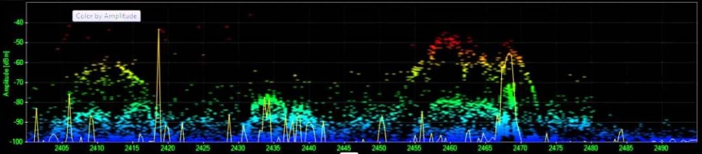
The second version shows similar graph coloring, with an aligned y-axis scale on the left side so it’s easier to see that -50 and above is red, -55 is orange, -80 is light green, etc.
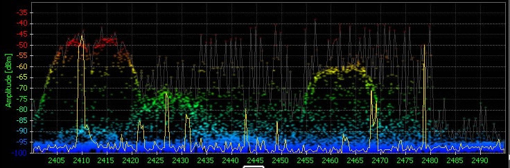
The third image completely changes the coloring. All three images are based on a timeframe, usually 1-2 minutes. This chart shows all the amplitude-spectrum points with data measurements within the timeframe, but the top two versions of the chart don’t show how often any particular point has a data measurement. The third chart bases the color on how many data measurements each frequency slice has had starting at high amplitude and summing as you move down to the bottom of the chart. Take a look at the middle of channel 2 (the labels in this version are showing the Wi-Fi channels), the blue background shows that there was a signal at that amplitude, but it was very brief, most of the signal around channels 1 and 2 are low, in the -90 to -100 range. As you move over to Channel 11 you can see that there was a fairly active signal around -40 and then a really active signal around -60; this is likely showing both sides of a very active Wi-Fi connection. By bringing in the time element, this version of the graph increases the data-ink ratio by an order of magnitude! For the next few years we let people choose which version of the graph they wanted to see, even though the time-based version was overwhelmingly the favorite.
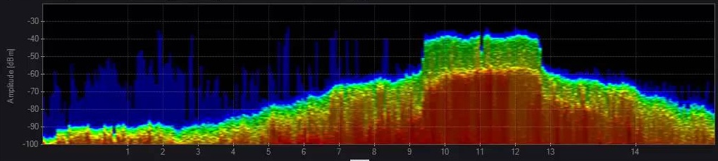
Also notice in the final version of the chart that the labels are no longer bright green; the gray labels reduce the visual impact of the non-data information to help focus on the actual data.
Footnotes:
- The first version of Chanalyzer software was called Wi-Spy Viewer 1.2. I think I named it 1.2 so that it sounded like it wasn’t brand new and possibly buggy! ↩︎
- My favorite data visualization technique for space-time data is small multiples. I tinkered with small multiples in Chanalyzer multiple times… pun intended 😄 ↩︎


Leave a comment